
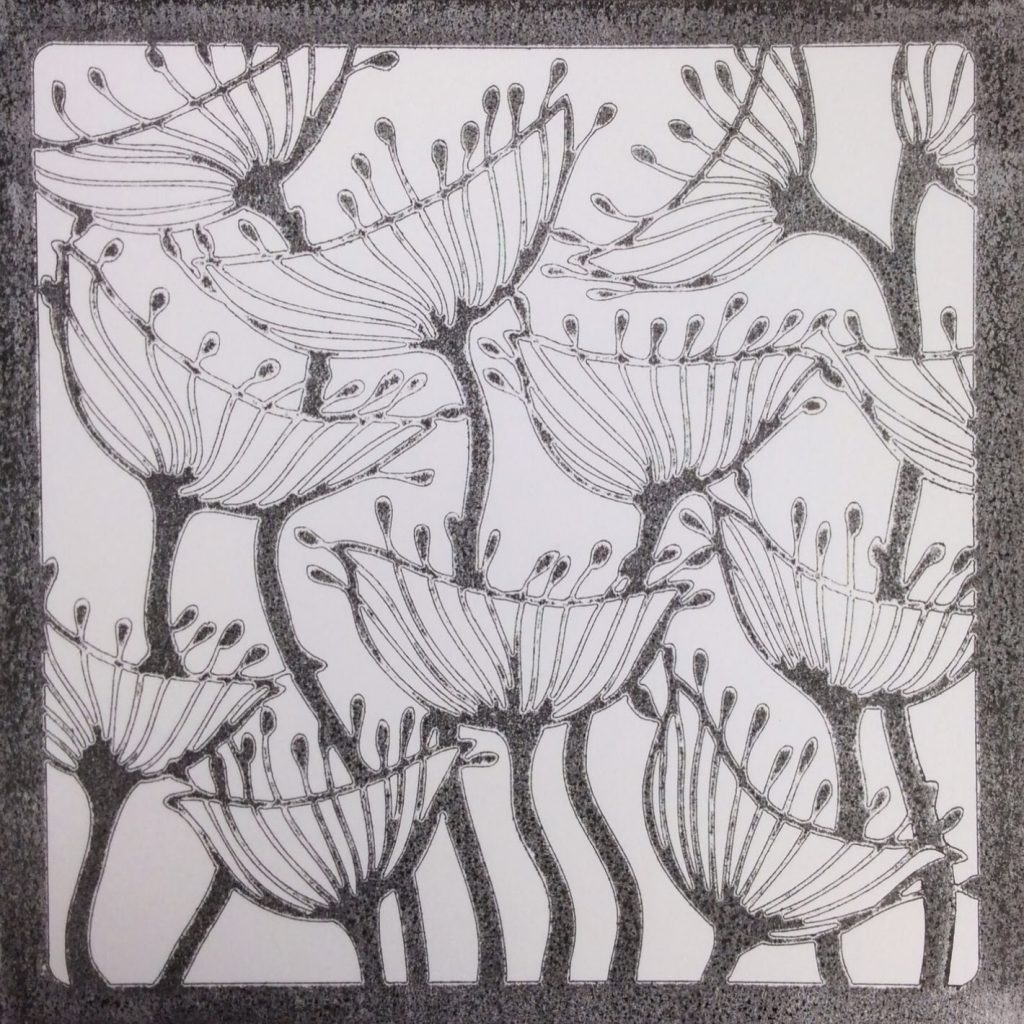
Seed Head Stencil – A choice point…
Monday Monday! Trees and Flowers.
Thought I would introduce you to a lovely set of brand new Clarity flower stencils today.
Especially since there’s a Stencil Sale on ALL stencils until midnight tonight!


I took the Seed Heads Stencil and played with it.
Here are my findings.
I used
Seed Head Stencil 7″ x 7″
Embossing Machine (E-Bosser)
Make-up sponges
Colouring Pencils
Here goes:
Ink up the stencil with Black Soot Distress Pad. The result was better and less blotchy when I used a Speedball Brayer to distribute the ink.

Check out the difference.

Lay a piece of square white card on the inky stencil.

Now here we can decide how dark we want the black to be by how much pressure we add to the Embossing machine.
I am going to go down two routes for you: one dark, one lighter.
I control this by how much copy paper I add to the sandwich I put through the embosser.
More copy paper, more pressure on artwork = darker
Less copy paper, less pressure on artwork = lighter
Pretend you want to cut a die. You won’t use a soft mat. You are not embossing the card; you are simply using the machine like a mangle.

This example here shows a darker example which is quite blotchy, because I didn’t use a Brayer to spread the ink out evenly.
But let’s go with that for a while.

Wash and dry the Stencil.
Position it over the top with masking tape.

Use our fantastic Stencil Brushes and Make-up Sponges to colour the background with Distress pads and Adirondacks.
Both work well.
I used
Lettuce Adirondack
Spiced Marmalade Distress pad
Milled Lavender Distress pad

Use the make-up sponges to add depth of colour to the
flower heads.

So you can see here, when I removed the stencil,
I wasn’t thrilled with the black blotchy frame.
What did I learn? To spread the ink on the stencil with a brayer.

What can I do? Cut off the blotchy frame!

That’s better!


If you like, you can spend a pleasant hour doodling, filling the flowerheads, too. Mine is a work in progress…

Or we can go down a different creative path.
Rewind to the start
using a brayer to spread the ink out evenly,
less copy paper = less pressure = grey.
I LOVED this effect.

It reminds me of a fantastic Fabric design by Sanderson!

At this point, I was so delighted with the work, I really wondered whether I shouldn’t just leave it alone…

But curiosity got the better of me, and I got out my lovely box of Faber Castell Colouring pencils

My, how time flies when
you are lost in a world of shading and blending…

Avoiding the pin-line white of the flowers,
I proceeded to shade in the seed heads with
Light Flesh, Dark Flesh,
Pink Madder and Rose Madder.
I toned down the white backdrop with Ivory.

I added shade with
Warm Grey, Cold Grey
and finally, a 5b Pencil

I could spend another hour, gradually adding more shade…
but I’m already running late!

So, there we are. Same stencil, completely different look.

Which one do you prefer? I know which one I like better!
Now apply those ideas to the other new Flower Stencils
in your mind’s eye…
with much love from

52 thoughts on “Seed Head Stencil – A choice point…”
That is amazing Barbara and so affective ( I love the Honesty my self ) xx
Lovely Stencils Barbara. I like the the one coloured in with the pencils.It has a more delicate warm feel about it. Great post.
articulate start to the week, fantastic stencils. Thanks
Just fabulous xxx
Love the subtle look that the pencils give Barbara but both are brilliantly executed. Must have a look at the masks before the sale ends. Pat x
I love your stencils Barb, and I adore what you have done, with both! I don't think I can choose between them! Xxx
Lovely stencils again, and lovely artwork. They are both totally different, but I like them both, wouldn't be able to choose.
Laurence xx
I love these, so lovely to do, very relaxing. I use a big shot embossing machine so the stencils won't go through so I use my light box and just emboss the edges, this (I think) looks lovely and then I colour, as I said, very relaxing. Now all I have to do is choose which ones I can get, if I could it would be all of them but I must be good, I'm thinking the poppy and pods. I think I prefer the one you did with the brayer but only by a margin as they are both beautiful pieces of art work. Thank you so much for my daily fix, I now look forward to my Gray days, Mrs Andy Day.
Love them both equally really, Barbara .. the shading you've done really makes them 3D…fabulous xxxAnnie
Hi Barb,
Love them both but if I have to choose, it will be the one with the pencils, mainly because it is more subtle and delicate. Off to buy some stencils me thinks! Thanks Barb again, love Alison xxx
Choose my favourite? Not on your life – I love them both!
Amazing inspiration Barbara, thankyou and thankyou also for the stencil sale to help with our purchases. I almost put an order in yesterday but so glad I waited as I can add the new ones to my list now.
lovely stencils Barbara – yet again and I love these two can't pick a fave love the subtle colour and shade of the second one but then I love gradient shading of the first one xx
Love them but think like the lighter one best x
Loving the new stencils – the pink one is my favourite, but both are really wonderful. Haven't had time to play with what I got for Christmas yet, so can't really buy anything new … only one more room to decorate and then it's play-time!
These are lovely Barbara-the second one edges it , lovely subtle colours.
All of your stencils are great.
Like Mrs Andy Day I use a big shot so can't get these through.I cut down my leafy swirl stencil to fit in and it works but then the stencil is a bit wobbly when I am using it to ink!
Would be great if you did a few more 6×6 or5x7 ones- just a thought as I know you can't please em all!
XxRuth
Oh really gorgeous! Prefer the inking on the second one but the colouring of the first! I'm just getting to grips with shading and blending with Pro Markers and Spectrum Noir, don't know if I'm brave enough to try pencils though. Inspiring as always, thank you xx
Barbara Gray !!! You really are a temptress ! These stencils are lovely and I will have to go and browse on the Clarity Stamp website when I get home now !! Both cards are beautiful but if I had to choose between the two I think it would have to be the second one . I amm just getting to grips with my ebosser so this will be good practice x
I think they're both lovely, but am tending to the coloured pencil one too, amazing depth of shading you've achieved with the pencils Barbara…and I really like the effect cutting the frame off gave the first artwork…made it more delicate somehow…lovely…right I'm off to the Clarity website !! xx
Oh Barbara, you keep on doing it, more items to add to my ever growing wish list. Also another technique to learn as I would never have thought of using the stencils combined with the eBosser in this way. On looking at both pieces of artwork I prefer the second one as I feel that the seed heads just pop off the paper (3D effect).
Great pieces of artwork in their own right. Like both for different techniques and effects.
Both are great, but in very different ways.
If forced to chose I would go for the second, i love the shading and more muted effect.
Hugs x
Lovely pieces of work – that last one would look good in fabric ………
I've just had a parcel come and I can't remember what's in it! and I know there is another on the way….. I wish you'd give up tempting us!
p.s. did you lay the stencil on paper to brayer so you had a negative – if so what did that look like or was it a bit wobby or perhaps you used a whatsit mat…… trying to think what it's called ……. it's my age……. oh yes, splodge mat?
I love the new stencils and your makes are both brilliant. If was to choose I'd choose the second one, the soft shading and colouring using pencils wins for me
Jackie x
Love, love, love the stencils, my fav is the seed heads. Joan x
hello Barbara – these stencils are amazing – no wonder I never have any money!!! Gorgeous – I love both of these but probably prefer the first one – just because its brighter and I'm definitely a brighter person!!!! I mean colourwise – not otherwise – lol! Hugs Rachel xx
I like both of them lots. I have already been to the website. First you make me buy spam, now I have to buy more gorgeous stencils to play with. I still have another parcel on the way. Oh boy, I shall have to start cutting down on my shopping, but how can I when you keep coming up with such beautiful tempting things for us to play with. It would be rude not to have them, now wouldn't it? xx Maggie
Spam! What will people think Maggie, you are funny! Xxx
Maybe, I am turning into the Clarity clown? xx Maggie
Fabulous stencils fantastic offer how lucky we are have put my order in .just shows us how versatile stencils are thank you Barbara for our daily blog xxx
They are both very nice Barbara but I prefer the second one as I love to colour in, it's so therapeutic . I could colour all day x
These are gorgeous stencils. I have the poppy one already and now would like the others…….I put an order in yesterday!!! 🙂 I like the effect of both though I think I prefer the second one. I agree with others that colouring in is so therapeutic. xx
Loved both and will try both, Thanks for your ideas and time to explain them
Lorna D
Gosh which one do I prefer? That's a difficult one-I think the coloured background with Zentangling one, but all look so effective. x
I like both of them – shows the versatility of the stencils. I'd love to see what they look like embossed or even letter pressed. Oooh those crafty juices are flowing. Must go and visit the website.
Lesley
Oh dear asking us to choose between thee artwork, very difficult as everything you do always looks wonderful to me. I think I prefer the second one colours are quite subtle, but could happily spend an hour doodling. I ordered the poppy stencil yesterday, wish I had seen the others, just love them. Not got an embossing machine yet, hoping to get one very soon but not sure which to get so that your stencils fit. Beautiful cards as usual Lynne xx
Both of the artwork pieces are lovely, but I do like the way you have blended the pencils. Saying that I also like the colours on the inked one. All the designs are fab!
Aileen xx
Like most people I cannot pick between them as either one may be suitable for a different occasion. I love love love your step by step tutorial on both and will have to give this a go with a stencil I already have as I need to reign in the spending a bit in readiness for Sunday!!! I love the name of the colours Spiced Marmalade – sounds like I need some hot buttery toast and a nice cuppa to go with it and black soot makes me think of Mary Poppins!! I do wonder about my thoughts some times!!! As ever Barb a wonderful blog which was lovely to come home to today xx
Oh…more gorgeous stencils and must have's…..I do love them all, especially the last one….and now I have pencil envy too……lol….hugs….x x
Have you spelt that right Jo?xx
ROTFLMAO!!!!!
Snigger 😀
Loving the pencil one. So annoyed with myself as I put in an order last night and forgot to add any stencils and now I want these! Note to self – look better on the website!! Xx
Absolutely gorgeous, my fav is the coloured pencil one
Mx
Hi Barbara. How do you do it? You come up with something so different every day, amazing! I would go for the second piece, I love the effect of the brayer and your shading is stunning, even though the first one is beautiful too. Love all of the stencils and I must add a decent set of coloured pencils to my wish list! Take care.
more beautiful stencils, but have to sit on my hands for time being. i love the brightness of the distress inks but the one coloured in in pencils just looks 3-d. amazing what some shading and shadows can do! hugs xx
I love both of them, so different. I love all your stencils but unfortunately they wont fit in my Cuttlebug so think I will have to put a new embossing machine on my list. Still I am going to try and do something similar. Thanks again Jx
Gosh that's gorgeous Barbara. The second one is soooo delicate. Love it! X
I am surrounded by replicas of Sanderson's clock in my Kitchen I love it, but I bet he would wish he had thought of drawing the Clocks at each stage of their life!! I love both. I have the first one you did and everything I do with it looks lovely- that's good design see!!! X (I mean yours not mine)!!! Xxx
Hello Barb, great images, and as you say it is softer with the ink brayered on and less pressure. Bx
Oh No computer problems yesterday and I missed the stencil sale. Just when I had added some to my wish list .Oh well next time maybe
Fabulous stencils, wrong side of payday for me nay mind. Great tutorial , both look fab but I think the bottom one with the pencils just has it but I look forward to seeing the top one finished with more doodling 😉 x